Legend of Zelda has always had some interesting design choices; from its gameplay, to its level design, to its enemy creation and how it chose to inform the player of how to progress. Oversimplifying its weapons to make sure that they are intuitive to use and easily instinctual in recognizing when to use it. Enemies with only a single mechanic to perform makes them easy to deduce means of dispatching them; and the difficulty comes when mixing placement with variety with terrain forcing you to take into account more variables and manage more moving parts. It shows that they put at least some attention to how they create the experience in their games.
That doesn’t mean that the Legend of Zelda is a perfect fleet and even its best ships have a few holes in them. The one that comes up time and time again is how they handle dialog.
Paragraphs of dialogue being spit at you. Line after line, given 10 words at a time. You sit there hitting the “next” button for minutes at-a-time. At the end of it you’re asked “Did you get all that?”

And the default placement of the cursor is on the “No.”
You hit “next” and you scream and storm away from the TV, incredulous to wasting your time for twice the length.
A game actively keeping you away from the action by forcing you, the player, to slow down and pay attention. Why would the cursor be set to “No”?
Default Options
We are inherently lazy people. Not in all respects, and especially not when we are focused, committed or invested in a subject matter; we tend to save our energy for these moments in particular. It’s more like we’re lazy for things that we don’t think we need to devote our attention to. This isn’t a judgment on the human race, because frankly there are too many things to devote my attention to already. I don’t want to spend the next 10 minutes in front of the drink section at 7-Eleven weighting the health-to-cost-to-satisfaction benefits of my next drink purchase. There are the 3 drinks that I normally go for and I just grab whatever I have a more emotional draw to at the moment: Diet Pepsi, Water or Coconut Water. I’m not going to go look for my next flavorful revelation at 7-Eleven’s drink shelves, so why would I spend any more brain power and energy worrying about it.
But understanding a wall of text, or a complicated machine to operate, or a complex application with never-ending branches of option-trees to use takes varying degrees of dedication and energy to understand. Opening up Photoshop for the first time and being bombarded with the plethora of menus and tools that you’ve never heard of is not only intimidating, but off-putting. Like any complicated machine or complex application, what is the thing that we typically do? We just do the bare minimum to turn on the system, and fiddle with the settings just enough to get it to run the first time. We find the magic select and start with cropping and rescaling, poof we made something with Photoshop.
We keep the settings relatively simple and the barrier to entry for the system becomes something manageable. And for the most part, many of us don’t even fiddle with the settings. These become the new default settings that we use.
Default Options are important because it’s a bias that makes us think of a representation being what the social norm is and helps us leverage that we don’t want to give mind to things that aren’t immediately important to us and submit to whatever the default is.
The classical example is Organ Donation rates amongst different countries. Countries like the UK and Germany have low Organ Donation enrollment rates, but Sweden and France have high Organ Donation enrollment rates all of which aren’t mandatory Organ Donation countries. People generally attribute this to some cultural differences between the nations, like Sweden and France being more altruistic in nature or more progressive, socialist and forward looking. While some of these things may or may not be true, what is clearly different is how people decide whether to become Organ Donors or not.
UK and Germany are countries where during registration you have to Opt-In to become and organ donor, meaning that the default option for these countries is to be non-donors. You have to make the effort to check the box to become an Organ Donor. France and Sweden, on the other hand, are Opt-Out countries, meaning that the default option is to become a donor. You have to check the box to not become an Organ Donor.

In the Opt-In countries, a person has to put extra-effort into becoming the donor where conversely Opt-Out countries you put the extra-effort to not be a donor. It’s not that we are inherently selfish people, or that those in their respective countries are more altruistic in nature but that we are inherently lazy and giving us the time to think of the reasons to put effort into going against an option means that we need to develop reasons about that option, normally something that we don’t want to do.
Opt-In: Why would I allow myself to be an Organ Donor? I’d always be in fear that when I’m in the hospital that they’d be trying to harvest my organs when I might have a chance to live. Everyone else is doing the same thing anyways.
Opt-Out: Why would I not want to be an Organ Donor? If someone else could use my organs when I’m dead already, is that such a bad thing? Everyone else is doing the same thing anyways.
Choice Architecture and Evolution of Start Screens
Defaults aren’t a good or a bad bias to have, but like anything it’s all about how they are used to influence our decision making.
The whole idea of defaults is that they illuminate a cognitive path of least resistance, a bias to the least amount of effort to make a decision on some matter and get it out of the way.
A good designer is able to exploit this bias to, say, start a game as quickly as possible.

Ever wonder why the “Start Game” option was always where your cursor started on when you start up a game?
Or why the there was always a particular patterned order to the start screen options. “Start,” “Continue,” “Options,” etc…
While primitive, it has two design implications. The first is “what should the player be focused on primarily?” It should be being allowed to play the game as quickly as possible. The second is “what should the player focus on next if they aren’t starting a new game?”
The first defines a default setting that the creates a path of least resistance to starting a game. The second defines a visual weight to each option on the menu. The further away from the default option and the more complicated the options, the more resistance from the default is experienced. Meaning extra, options, high scores get looked at more rarely on a whim unless the player absolutely needs to change the difficulty or see the in-game art.
With this, the player is able to spam the “select” button from the moment the red power light of the console turns on till some form of agency is given to us in-game.
A, A, A, A, A, A, did the game start yet?, A, A, A, A, ????????????
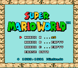
This became important because when switching from NES to SNES, saving your game became more common. This meant that “New Game” wasn’t the norm anymore, but the exception. “Continue” became the new norm, and continued to be so. This meant that “Continue” should’ve became the default in this case, so that the path of resistance be limited for the default choice.
Because of the rearrangement of the “Continue” and “New Game”, it means that our current A-spam behavior is unbroken and our impatient biases can continue.
A, A, A, A, A, A, fuuuuck my thumb hurts. am I playing yet?, A, A, A, A, ????????????

But with the inclusion of the Wiimote, we could do different things with the options on the start menu. If the player was on a controller, than they could select options in one form, but how do you do the same for selection with a mouse? The cursor wasn’t necessarily defaulted to an option on the screen, so designers had to get a bit creative. They had to come up with a different way of conveying default option for people to click.


This was done by giving more visual weight for the default options. Specifically, these options are given more screen real estate making them more obvious to click on than other options.
In these ways, the path to resistance is kept to a minimum and allowed for players to quickly button spam their way to playing the game from where they probably wanted to start.
Choice Architecture and Player Choice
The brain doesn’t like choice. It would rather be on autopilot/reactive mode for as much as possible because the constant contextual switching of topics requires an amount of concentration of changing faculties that we’d rather keep consistent if possible. It’s the kind of problem that escalates a disruption from flow, that balance between concentration and engagement where time flies by, to where because we’ve lost our train thought so completely that we mentally forfeit our desire to continue our activity for awhile. Have you ever been so engrossed in an activity that when someone interrupted you that it took the next ten minutes of surfing reddit to motivate yourself to the same level of engagement prior? That’s the problem that I’m talking about.
We’re good at working at one thing at a time, or multiple things as long as they require similar brain-regions activated to perform those skills. Managing a kitchen involves things like cutting vegetables to tossing the skillet, we’d rather just focus on one section of the kitchen at a time. Stick to the cutting board till all of the cutting is done, then do all of the stove work as grouped as possible.
The more choice that we have, the more variable we need to weigh. More choice means more work. More work means the default becomes more enticing of an option.
Don’t believe me? That’s fine. I gave our brains more credit, too.
There was a study, though, to test this phenomena out. The setup was simple, a doctor assigns a patient for hip replacement surgery after they’ve tried out various regiments. Then they find out the patient hasn’t tried one. The doctor could either A) Call the patient to have them try the new regiment X or B) Do nothing and have them get the hip replacement. Notice that B) the hip replacement surgery is the default option since this requires the doctor to do nothing in this case.
The test was how the differences in regiment affected the doctor’s behavior. In group 1, X was to only try Ibuprofen. In group 2, X was to try Ibuprofen and piroxicam.

Not much difference between the two groups right?
Group 1 almost unanimously would tell their patients to try out the Ibuprofen regiment. No pain from hip replacement, no rehab for weeks/months.
Group 2 didn’t fare so well. Actually 72% of the doctors decided to do nothing and let their patient take the hip replacement. The problem being that because we let option A be a more complex option, the doctor opted to the default choice.

If even trained medical professionals could fall for such a bias, why would we ever think that a player wouldn’t do the same thing?
We fall for defaults all of the time while playing games, completely biased towards them, because increased complexity in choice activates the lazy part of the brain that makes the default more enticing.
This is because there is a misled assumption that we want more options to better reflect our personal compatibility and more options means more freedom of choice. More choices means that we find a more personalized choice that suits our personality, right? These assumptions are true, but inherently add pressure to our choices since they require assessment to which option is better and potential for regret can increase.

Like finding out you need a new phone. You first Google for phones that recently came out and get a list of a half dozen or so phones. Then you take that list, go on gsmarena, gizmodo, cnet, youtube, reddit, and however many websites doing comparisons between the phones narrowing the list down little by little. After a few hours of research you have a phone that you think would be something that you’d like. Then you go and pick it up, play with it for a few hours to set it up to how you like and go show it off to your friends. You find out one of them just got a phone from the list of potential phones that you were looking into, so you ask to look at it. Your gut sinks as you hold onto your friends phone, playing with it to make sure that the things that were important for your phone aren’t found in their phone or else you’re stuck with a phone that wasn’t the best around for the next 2 years until you can buy another one and your research wasted.
And this increased choice becomes a problem in gaming where we’re investing more than a couple of hours to get to a point of choice in the game. Games that can last 40 hours give our choices a lot of weight and our choices can compound on one-another making our game irreparable to the one that we wanted to have.
We’ve all felt it. That moment where a major decision has to be made and you sit there for a while weighing the pros about one choice over the other. Alliances in Elder Scrolls. Assassinations in Grand Theft Auto. Killing the brain-dead corpse of a crewmember in SOMA. To go investigate the sound in the distance while a monster is on the prowl in Until Dawn. Pivotal moments that you can’t take back and that ruin the 10-20 hours that you’ve spent in your current playthrough.
With the amount of choice that can happen, though, it becomes easier to pick the default choices. Take the Mass Effect Series or Start Wars: The Old Republic as examples of this. Both games have a lot of dialog to sit through and making every choice pivotal is a bit ridiculous and emotionally draining if it were the case.


Because we see so much dialog in these games, it’s just easier to pick a side and conform to it whenever the opportunity arises. In the case of these games, it’s always picking one side Light/Paragon or Dark/Renegade whenever the option is up. Picking one side early on defines your default and keeps things conceptually simple to put up with the constant dialog and effort minimal when climbing the decision trees in both Mass Effect and Star Wars: The Old Republic.
Gameplay also gets hurt by too much choice. When things get too complicated, too much depth to the actual gameplay, we look for shortcuts to through the game as easily possible.
Final Fantasy 7 had a neat system of combining magic to modifiers via the Materia system, but with hundreds, if not thousands, of combinations to create it left players with a lot of variety in combat and the design left game-breaking holes that people sought out to make every encounter a conceptually solved puzzle.
Sneak Attack-Deathblow, Mega-All, Pre-Emptive -> Start a round doing Deathblow to all enemies at the start of a round.
Comet (lvl2)-Quadra Magic, Comet (lvl2)-HP Absorb, Comet (lvl2)-MP Absorb -> Cast 16 Comets at once and absorb a ton of HP and MP to repeat indefinitely.
Even before all of this, you would tend to A-spam the “Attack” command until each encounter was over because the shifting context from Exploration to Combat was mentally jarring.
You find your bread-and-butter in a game and waver from it sparingly because the amount of choice is just too much in these games; so much so that they become a burden at points to devote your brainpower to them, juggling your progressing through the game as quickly as possible, where to travel to next, what side-quests are currently active, can my characters survive until the next town that’s visited, etc…
Default Choice Inversion
So, back to what we were talking about at the beginning. Why does Zelda have its default placement on “No, Can you repeat yourself”? The default that the player wants to choose is obviously “Yes,” so they won’t have to skip through the owl’s text for a second or third time.
The big reason is because the designers at Nintendo know that the player’s instinct is to A-spam their way through the dialog, which isn’t always the right thing to do. The owl is there to give you some important information, so to prevent you from wandering around aimlessly for another half-an-hour before going back to the gas station and asking for directions, they set what your default action will be. The games makes sure that you know you’re skipping something important, like scrolling through the bottom of the Terms of Service, causing you to do an explicit action to let the game know that you got the information that you need to progress.
The default choice that the game gives you is an inversion of what the player would normally choose as their path of least resistance. This point of friction exists solely to make sure that you give some mind to the dialog being spoken to you. Using your default behavior against you so you have the right information to have less friction in the future and a better experience with the game overall.
So… Did you get all that?
Twitter: @GIntrospection

December 17, 2015 at 07:44
Great post. The owl is an example of an annoying choice to make you register information closely. But at other points in Ocarina of Time – I’m thinking specifically of when you first meet Zelda in Hyrule Castle – you get given a choice that is effectively a non-choice. It’s the game’s idea of a joke. Zelda asks you if you’ll help her save Hyrule and the choice pops up: yes or no! I can’t remember which it defaults to – probably yes – but who can resist being contrary abd saying no just to see what happens? You say no, and Zelda looks shocked and begs you again. The dialogue just goes round and round without any way out until you relent and say yes. It’s a nice comical way of showing the limits in the game. I think of it as the game dev’s way of saying, look, choice is really not always a good thing, even though people like to think it is!